
How to Choose a Marketing Dashboard for Beginners
Want to save hours on marketing data and make faster decisions? A marketing dashboard can centralize your data, automate reporting, and help you track performance across all platforms in one place. But picking the right one can be tricky.
Here’s how to choose the best dashboard for your needs:
- Understand what it does: Dashboards pull data from tools like Google Ads, Facebook, and email platforms into one screen using APIs.
- Set your goals: Define the metrics that matter most, like conversion rates or revenue, and avoid vanity metrics.
- Look for ease of use: A simple interface, pre-built templates, and drag-and-drop features are key.
- Check integration options: Ensure it connects with your platforms automatically to avoid manual data entry.
- Compare tools: Free tools like Google Sheets work for small setups, while paid options like Databox offer advanced features.
- Test before buying: Use free trials to see if the dashboard answers your critical business questions.
Quick Tip: Focus on tools that save time and provide actionable insights. A good dashboard should help you spot trends, adjust strategies, and make decisions faster.
Keep reading for a step-by-step guide to selecting a dashboard that fits your goals and budget.
Step 1: Learn What a Marketing Dashboard Does
What is a Marketing Dashboard?
A marketing dashboard brings all your marketing data – like Google Ads, Facebook, email systems, and website analytics – into one place. Instead of switching between multiple accounts, you get everything on a single screen.
This is possible because dashboards use APIs or built-in connectors to pull in data automatically. They also clean and standardize the information, ensuring you’re comparing apples to apples (like aligning Facebook’s "amount spent" with Google Ads’ "cost"). As Christopher Van Mossevelde, Head of Content at Funnel, puts it:
"A marketing dashboard is a tool that makes raw data easy to draw conclusions from".
To work well, dashboards rely on four essentials: reliable data sources, meaningful metrics, KPIs that match your goals, and clear visualizations like charts or graphs. These features make dashboards especially helpful for beginners.
Main Benefits for Beginners
For those just starting out, dashboards offer some game-changing advantages. The first big one? Centralization. All your key metrics are in one spot – no more juggling between platforms.
Another major perk is automation. Dashboards eliminate the need for manual data entry, which not only saves tons of time but also reduces errors. By syncing data automatically, you can avoid the hassle of reconciling numbers manually and free up hours for more important tasks.
Dashboards also help you make sense of raw numbers. For example, a 3% conversion rate means more when you can compare it to past performance. With features like trend lines and period comparisons, dashboards show whether you’re improving or falling behind. They also act as a "single source of truth", ensuring your Sales, Marketing, and Finance teams are all working from the same data.
Finally, dashboards enable quicker decision-making. In fact, they can help you act up to five times faster. Instead of waiting days for a report, you can catch issues early in the week and adjust your strategy right away.
sbb-itb-0a5855c
Step 2: Set Your Marketing Goals and Metrics
Identify Your Marketing Goals
Before choosing a dashboard, it’s crucial to define your specific objectives. Start by asking targeted questions like, "Which channels generate the highest revenue per dollar spent?" or "Is organic traffic increasing month-over-month?". These questions help pinpoint the metrics that truly matter for your business.
Organize your goals by funnel stage – Awareness (traffic), Consideration (engagement), and Conversion (leads and revenue). This approach lets you zero in on metrics such as website traffic, conversion rates, revenue growth, or customer retention. For example, if building brand awareness is your focus, you’ll track metrics like impressions and reach. If lead generation is your priority, you’ll monitor Marketing Qualified Leads (MQLs) and Sales Qualified Leads (SQLs).
To refine your objectives, apply the "So What?" Test to every goal. Ask yourself "so what?" three times for any metric. If you can’t identify a specific action to take by the third time, that metric doesn’t belong on your dashboard. As Avinash Kaushik wisely explains:
"The best metric is one that forces a change in behavior. If the metric doesn’t change how you act, it’s just a number taking up space on a screen."
Once your goals are clear, you can confidently select a focused set of KPIs to track your progress effectively.
Choose the Right KPIs
With your goals in place, narrow your focus to 5 to 10 KPIs that align with those objectives. Tracking too many metrics can create unnecessary clutter and obscure critical insights. Prioritize outcome-focused metrics like leads, revenue, and pipeline over activity-based ones like clicks or impressions.
It’s essential to differentiate actionable KPIs from vanity metrics. Vanity metrics, like follower counts or page views, may look impressive but don’t provide actionable insights. On the other hand, actionable KPIs – such as Cost Per Lead (CPL), Customer Acquisition Cost (CAC), and Lead Conversion Rate – directly inform decision-making. For instance, if you’re running paid ads, focus on metrics like Return on Ad Spend (ROAS) and Cost Per Acquisition (CPA). For email campaigns, track Click-Through Rate (CTR) and revenue per email.
To make your KPIs meaningful, always provide context. Compare current data against a target, previous performance, or industry benchmarks. For example, a 3% conversion rate is only insightful if you know whether it’s an improvement from last month or how it stacks up to industry standards. Contextualizing your KPIs ensures they drive actionable insights and guide your strategy.
Step 3: Look for Features That Are Easy to Use
Simple Interface
A user-friendly interface can make or break how often you use a dashboard. Surprisingly, 40% of users rate their dashboards at three out of five or lower, and 72% still rely on exporting data to Excel when dashboards fail to deliver clear insights.
The most effective dashboards highlight critical information right away. Tools with drag-and-drop builders and pre-built templates are ideal because they eliminate the need for coding or technical expertise. Additionally, the layout should follow natural reading patterns, placing essential metrics in the top-left corner where your eyes naturally go first. This makes it easier to catch issues like unexpected cost increases or broken landing pages at a glance. Companies leveraging streamlined dashboards can make decisions five times faster than those without them.
Data Integration Options
A dashboard is only as good as the data it connects to. It should integrate seamlessly with all your platforms – think Google Ads, Meta, or email marketing tools. Without automated integration, you’ll waste time manually downloading and transferring data. As MetricNexus Blog aptly states:
"If your data is not flowing in automatically, you do not have a dashboard. You have a chore."
Opt for tools with "plug-and-play" API connectors to avoid manual uploads. For example, Publicis Sweden adopted Funnel’s automated integration in 2026, cutting reporting time by 90% and shifting their focus from tedious spreadsheet management to strategic analysis. Poor data integration and quality issues can cost businesses $12.9 million annually, with U.S. employees spending an estimated 540 hours each year fixing bad data. To avoid this, list all your marketing channels and confirm the dashboard supports native connections for each one. A centralized system ensures you’re not stuck analyzing isolated data from individual channels but instead get a comprehensive view of your marketing performance.
Seamless integration is the backbone of creating detailed, customizable reports tailored to your goals.
Customizable Reports
Your dashboard should adapt to your specific needs, not force you into rigid templates. Look for tools that allow custom KPIs and formulas, such as Gross Margin ROAS, and offer interactive filters to break down data by date, region, or campaign.
Drill-down functionality is another must-have. Instead of overwhelming you with every metric on one screen, a good dashboard keeps the main view clean while letting you click into specific metrics for more details. This reduces clutter while still giving you access to the granular data you need.
Real-time data syncing is also crucial. Automated dashboards can cut manual reporting by over 80%, letting you monitor performance continuously and make timely adjustments. While pre-defined templates can speed up setup, it’s important to choose a tool that allows modifications as your business evolves. A flexible dashboard grows with your needs, saving you the hassle of starting over as your priorities shift.
How to Create the Best Marketing Dashboards That ACTUALLY Make Sense
Step 4: Compare Marketing Dashboard Tools
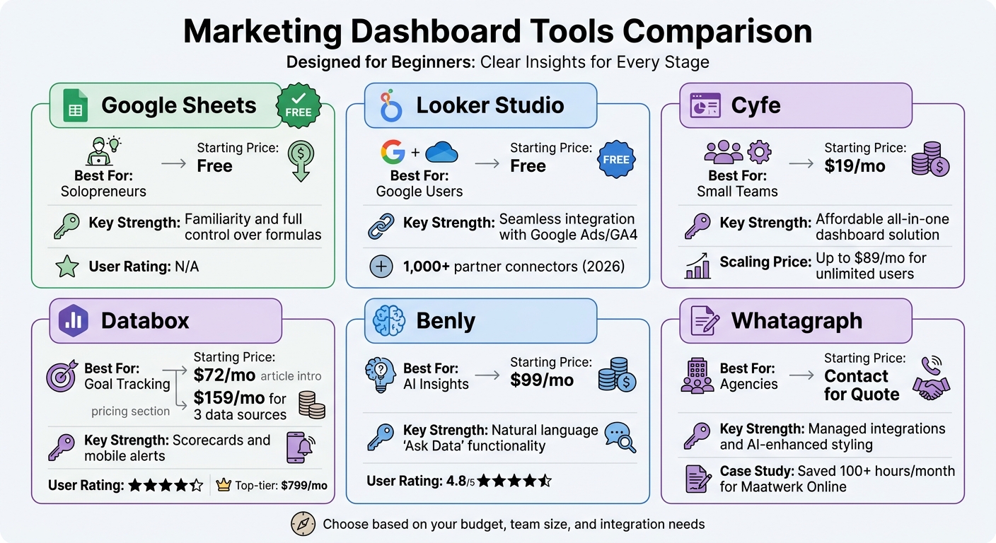
Marketing Dashboard Tools Comparison: Features, Pricing, and Best Use Cases
Tool Comparison Table
Here’s a quick comparison of marketing dashboard tools tailored for beginners, highlighting their pricing, strengths, and ideal use cases:
| Tool | Best For | Starting Price | Key Strength |
|---|---|---|---|
| Google Sheets | Solopreneurs | Free | Familiarity and full control over formulas |
| Looker Studio | Google Users | Free | Seamless integration with Google Ads/GA4 |
| Cyfe | Small Teams | $19/mo | Affordable all-in-one dashboard solution |
| Databox | Goal Tracking | $72/mo | Scorecards and mobile alerts |
| Benly | AI Insights | $99/mo | Natural language "Ask Data" functionality |
| Whatagraph | Agencies | Contact for Quote | Managed integrations and AI-enhanced styling |
Free tools like Google Sheets and Looker Studio are excellent for those with tight budgets, though they require manual setup and lack advanced automation. For those already using Google tools, Looker Studio offers over 1,000 partner connectors as of 2026, making it a strong choice for a Google-centric marketing stack.
On the other hand, paid tools like Databox (rated 4.4/5) and Benly (rated 4.8/5) provide advanced features such as goal tracking, AI-driven anomaly detection, and mobile-friendly apps. These tools are great for teams looking for more robust functionality and time-saving automation.
For example, in early 2026, Maatwerk Online reported saving over 100 hours per month using Whatagraph’s automated dashboards. Co-founder Lars Maat shared:
"The hours we’re saving is just pure profit. We now have the time to focus on more strategic things that help both our agency and our clients grow."
Similarly, Peak Seven saved 63 hours monthly with automated alerts. Digital Marketing Specialist Kim Strickland described the system as their "Bible" for maintaining a single source of truth. These examples show how the right tool can help shift your focus from tedious data entry to making impactful, strategic decisions.
Green Forest Marketing‘s Approach
Once you’ve reviewed the available tools, the next step is tailoring your choice to your specific needs – and that’s where Green Forest Marketing steps in. Using insights from earlier steps, we help clients choose and implement dashboards that align with their unique marketing goals. Whether you’re tracking SEO performance, monitoring Facebook ad campaigns, or measuring the success of email drip campaigns, we ensure the solution fits seamlessly into your workflow.
Our process starts by assessing your current tech stack and identifying the metrics that matter most to your business. From there, we recommend tools that integrate smoothly with your existing platforms. We also follow the 5-Second Rule: critical KPIs should be easy to understand at a glance, with the most important metrics placed in the top-left corner – right where your eyes naturally go first.
To avoid clutter, we design dashboards with role-specific customization. For instance, executives see high-level performance summaries, while campaign managers get detailed insights into individual channels. This approach keeps your team focused on actionable data without being overwhelmed by irrelevant information.
If you’re unsure which tool is right for you, we can guide you through free trials, help you test them using real data, and ensure your dashboard becomes a trusted decision-making resource – not just another platform you rarely use.
Step 5: Review Cost, Growth Potential, and Long-Term Fit
Setup Costs and Monthly Fees
Dashboard tools come with a wide range of pricing models, and the sticker price often doesn’t tell the full story. Most platforms base their fees on factors like user count, data connectors, or feature tiers. For instance, Looker Studio has a free version tailored for Google-centric setups, while its Pro version is priced at $9 per user per month. Databox, on the other hand, starts at $159/month for three data sources, with top-tier plans reaching $799/month. For enterprise options like Looker BI, annual costs can soar to around $60,000.
Be mindful of hidden add-on costs. Many tools charge extra for advanced features or integrations. Christopher Van Mossevelde, Head of Content at Funnel, emphasizes the importance of this decision:
"Choosing a dashboard tool is one of the highest-leverage calls a marketing team can make. Pick the wrong one and you’re stuck with manual fixes and wasted hours".
When budgeting, don’t just focus on subscription fees. Consider the total cost of ownership, which includes the time your team spends on manual tasks like exporting spreadsheets, reconciling data, and fixing errors that an automated tool could handle seamlessly. Align these costs with your overall marketing budget to ensure you’re making a smart investment.
Growth Potential for Expanding Businesses
The dashboard you select today should still meet your needs as your business grows. It’s essential to choose a tool that can adapt as your data and marketing goals evolve. For instance, if your team uses more than a dozen marketing platforms (a common scenario for many teams), you’ll need a tool with flexible APIs and broad integration options.
Scalability isn’t just about handling more data – it’s also about supporting a growing team and managing historical data archiving without limits. Some platforms, like Cyfe, offer pricing plans that grow with your business. Cyfe starts at $19/month for basic use but goes up to $89/month for unlimited users, making it a budget-friendly option for expanding teams. If your current tool can’t scale with your business, you might face the costly and time-consuming challenge of migrating to a new platform later.
Step 6: Test and Select Your Marketing Dashboard
Use Free Trials and Demos
Most marketing dashboard tools offer free trials, typically lasting 7 to 30 days. Use this period wisely by connecting your actual marketing platforms right away. This lets you see how well the tool handles your specific naming conventions, data volume, and scenarios you’ll face day-to-day.
Create a "must-answer" list of your top five weekly questions. For example: "Which channels generate leads under $50?" or "Are we on track to hit this month’s revenue goal?". During the trial, test if the dashboard can provide direct answers to these questions without forcing you to export data into Excel. If you find yourself relying on spreadsheets, that’s a warning sign.
Try the 5-second rule: show the dashboard to someone unfamiliar with your data. If they can’t understand the main takeaway within five seconds, the interface might be too cluttered. Also, cross-check the dashboard’s numbers with native platforms like Google Analytics or Meta Ads Manager to confirm the data pipeline is reliable.
Don’t forget to test mobile accessibility, especially if you often make decisions on the go. With 57% of internet use happening on mobile, your dashboard should display properly on smartphones, featuring large touch targets and a clean, single-column layout. Additionally, look for tools with anomaly detection or AI-driven alerts for sudden performance changes, such as unexpected spikes in cost per lead.
Once you’ve evaluated the dashboard under real-world conditions, you’ll know whether it meets your needs or not.
Make Your Final Decision
After testing, focus on three key factors: usability, features, and cost. The best dashboard is one your team will use regularly – not one that ends up forgotten in the "dashboard graveyard". Ask yourself: Can this tool answer critical business questions in under 60 seconds? If not, keep searching.
Ensure the dashboard includes native API connections to your platforms. Avoid tools that rely on manual CSV uploads or costly third-party connectors. Check the data refresh rate, too – whether you need updates daily for monitoring or hourly for campaign adjustments. And, of course, confirm the pricing fits your budget while allowing room for growth so you won’t have to switch platforms later.
Trust is essential. Studies show that 67% of users lose confidence in analytics when dashboards display outdated or inaccurate data. Look for tools with "last updated" timestamps and fast load times (under two seconds) to ensure your team relies on it for decision-making. If the tool passes these tests, you’re ready to move forward with confidence.
Conclusion
By following these steps, you can select a dashboard that aligns perfectly with your marketing needs. The right marketing dashboard can completely transform your workflow – saving you 10–20 hours of manual data handling each week and delivering automated insights in under 60 seconds. The secret lies in focusing on actionable metrics instead of vanity numbers and ensuring seamless integration with your marketing platforms to avoid constant manual updates.
"The best metric is one that forces a change in behavior. If the metric doesn’t change how you act, it’s just a number taking up space on a screen." – Avinash Kaushik, Author and Analytics Expert
Start by addressing your specific business questions and look for tools that offer intuitive interfaces and dependable data pipelines. Businesses using effective dashboards can quickly identify underperforming campaigns, saving budget and reallocating resources to strategies that deliver results – while competitors are still stuck in spreadsheets.
For those seeking additional support beyond dashboard selection, Green Forest Marketing provides a range of digital marketing services designed to complement your data strategy. From SEO and social media management to email marketing and Facebook ads, their team helps businesses transform insights into action with structured lead generation and follow-up systems. This ensures your marketing efforts remain both agile and impactful.
At the end of the day, the best dashboard is the one your team relies on daily to generate insights and drive better marketing performance.
FAQs
Which KPIs should I track first?
To gauge the success of your campaigns, focus on tracking key performance indicators (KPIs) that reflect campaign success, lead quality, conversion rates, and ROI. These metrics act as a compass, giving you a clear view of how your marketing efforts are performing. By analyzing these numbers, you’ll pinpoint areas that need improvement and refine your strategies. Prioritizing these indicators will help you make smarter decisions and ensure your campaigns are running as efficiently as possible.
How do I know if a dashboard is accurate?
To keep a dashboard reliable and useful, it’s important to stick to best practices for data accuracy and relevance. Focus on 10–15 key metrics that directly address your primary questions – this ensures clarity without overwhelming users with too much information. Arrange the data in a way that makes insights easy to grasp, and make it a habit to review these metrics regularly. This approach minimizes the risk of misinterpretation and helps drive more informed decisions.
When should I switch from free to paid?
When free marketing tools start falling short – whether it’s due to the hassle of manual updates, restricted visualization options, or challenges in centralizing and analyzing data – it might be time to consider a paid marketing dashboard. These platforms can streamline your workflow by automating processes, providing real-time updates, and offering customizable metrics. This means less time spent on tedious tasks and more focus on making informed decisions that align with your business goals.

